Shipped
iMobile 3.0
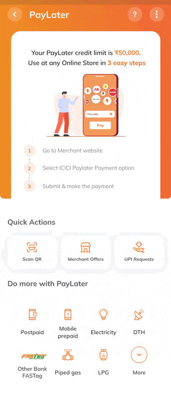
A redesigned mobile banking experience built to scale—bringing over 200+ features into a unified, intuitive interface that works for 30M+ users across India.
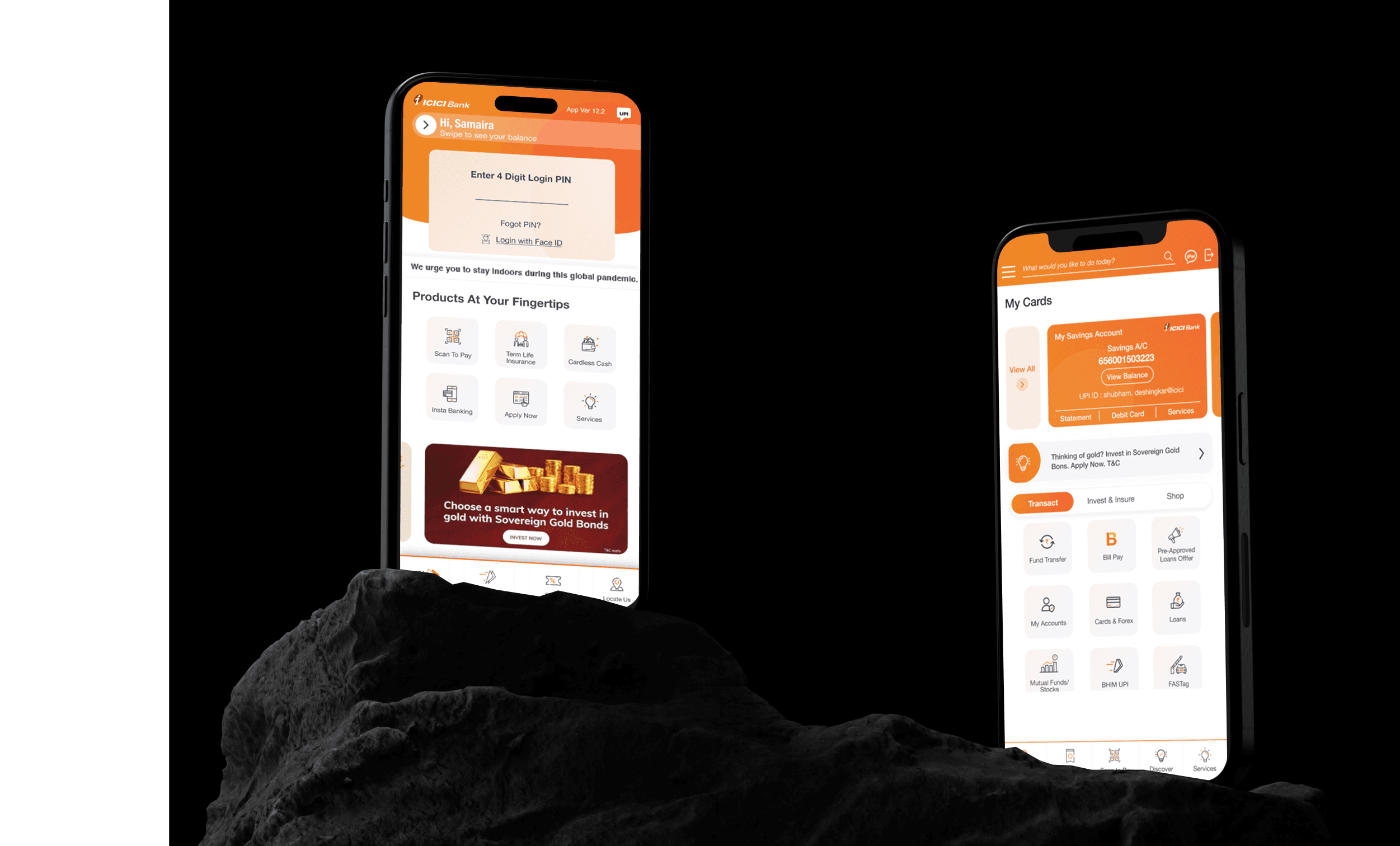
I led the UX revamp of iMobile 3.0 — designing a scalable system to streamline over 250+ banking and financial journeys, standardize components, and reduce development effort across teams.
iMobile is ICICI Bank’s flagship mobile app, offering payments, credit, investment, and insurance services. The 3.0 revamp focused on future-proofing the platform to support rapid feature growth, improved usability, and evolving digital banking needs.
Product
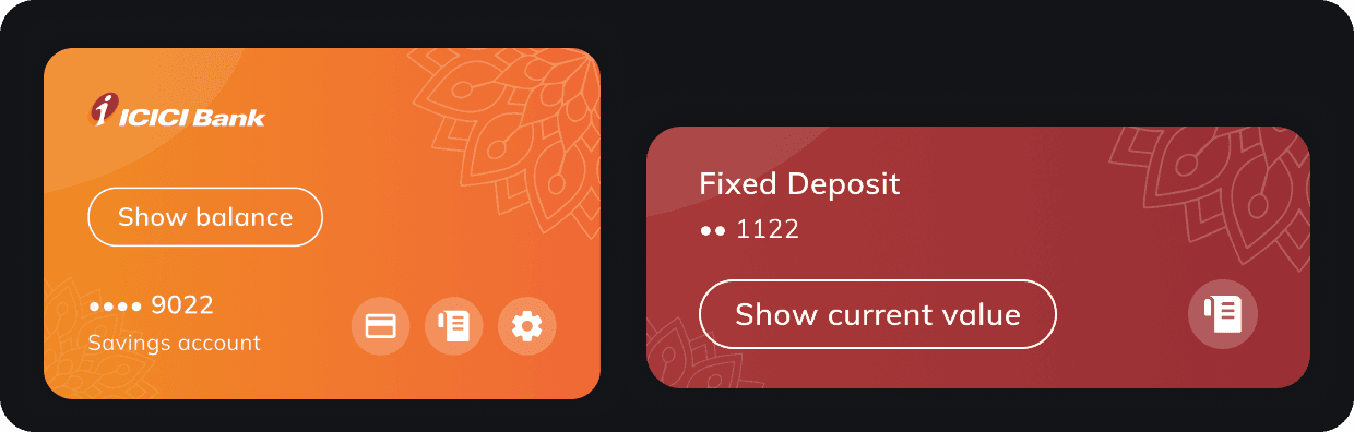
ICICI iMobile App
Skills
Product Design
Design system creation (atomic design principles)
Cross-functional collaboration
Design operations (DesignOps)
Documentation & knowledge management (Notion)
Wireframing, UI Design & Prototyping
My Role
Design Lead
Timeline
Q4 2022
What is iMobile
A Digital Banking Powerhouse with 30M+ Active Users and End-to-End Financial Services
iMobile is the flagship mobile banking app of ICICI Bank, India’s largest private bank. First launched in 2008, it became interoperable in December 2020—allowing even users of other banks to access its full suite of features under the brand iMobile Pay.
Some Numbers for context
28 million+
active users
6.3 million activations
by non-ICICI Bank customers between 2020-2022
4 weeks
average feature rollout
Why this revamp was so significant?
Redesigned for scalability, consistency, and usability
The iMobile app, originally built in 2015, was designed for a very different digital landscape. Over the next few years, India underwent a rapid digital transformation
The UPI boom and demonetization (2016–2018) reshaped how users transacted
The COVID-19 pandemic (2020) further accelerated the shift toward mobile-first banking
In December 2020, ICICI made iMobile interoperable—rebranded as iMobile Pay, it allowed even non-ICICI customers to use the app’s full feature set. This opened the door to millions of new users, making scalability, consistency, and usability more critical than ever
At the time, iMobile supported 200+ features, but the existing design and system architecture couldn’t support this growth efficiently. Competing with neo-banks and fintech apps required more than UI fixes—it needed a fundamental shift in how features were designed, delivered, and scaled.
Project Goal
To design a modular, scalable system for iMobile that could support its rapidly growing user base and expanding feature set—reducing development time, improving consistency, and enhancing usability. The revamp aimed to future-proof the platform, enabling it to adapt seamlessly to evolving user needs and digital banking trends.
First Steps
Understanding the Internal System
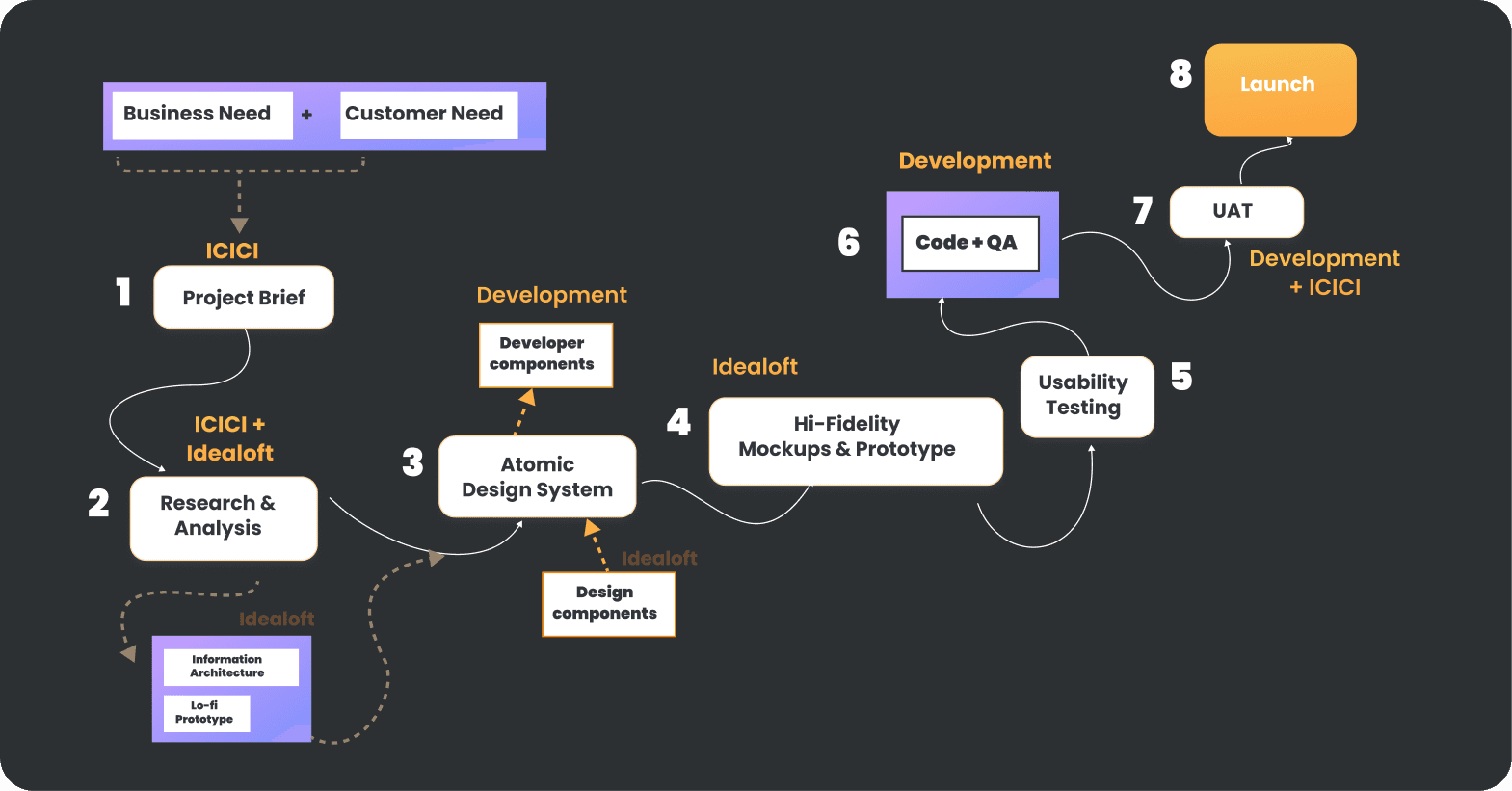
Before jumping into redesigning interfaces, the first priority was to understand how iMobile functioned internally—both structurally and operationally.
ICICI Bank had multiple design and development teams working in parallel across different product lines—cards, loans, UPI, investments, and more. Each team was responsible for individual modules within the app.
However, this scale brought its own set of challenges:
Inconsistent UI patterns due to independent design decisions
Misaligned development practices, resulting in implementation errors or duplicated efforts
Lack of a shared design language and disconnected communication between cross-functional teams
To address this, we began by:
Mapping the entire feature landscape and identifying overlaps or conflicts
Auditing existing design and tech workflows to find where breakdowns occurred
Laying the foundation for a standardised, centralised system that could bring all teams onto the same page
This system-level understanding shaped every design decision that followed—ensuring the redesign was not just visual, but foundational.
Implementing an Atomic Design System
Understanding the Internal System
Given the scale of iMobile, with over 200 financial and banking services offered within a single app, consistency and scalability were major challenges.
To address this, we implemented an atomic design system that allowed us to:
Break down the interface into reusable components—atoms, molecules, organisms—that could be easily applied across modules
Build a central library of nearly 200 components, drastically reducing turnaround time for both design and development
Enable the tech team to reuse tested, production-ready components, ensuring smoother implementation and fewer visual inconsistencies
Introduce design tokens for elements like color, typography, spacing, allowing teams to switch themes or roll out new product journeys with minimal effort
This system empowered us to scale faster, adapt to new feature requests, and maintain a unified visual and interaction language across the entire app. The result: what earlier took weeks could now be implemented in days—without compromising on quality.
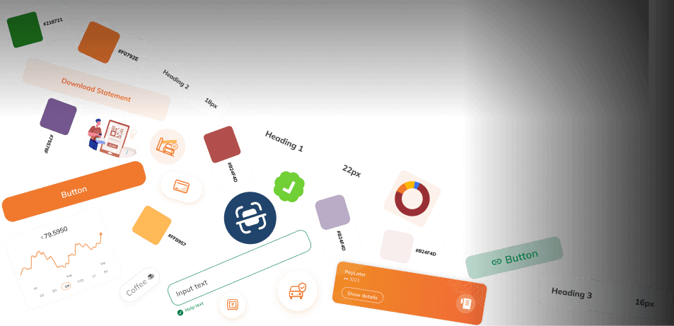
Introducing iMobile 3.0 Design System
Understanding the Internal System
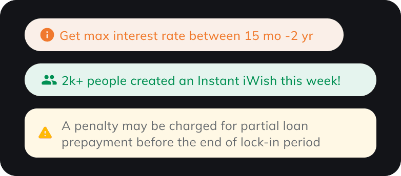
Standardising the User flow
Scaling the design system for 200+ features
With design system in place, we had the next big challenge, having more than 200 features came up with a new problem. Every feature having its own journey, and thus this could have broken the deisgn system, or creating new components for each flow would have defeated the purpose of having the design system in the first place.
We tackled this issue by coming up with a standardised user flow which could be scaled for every product


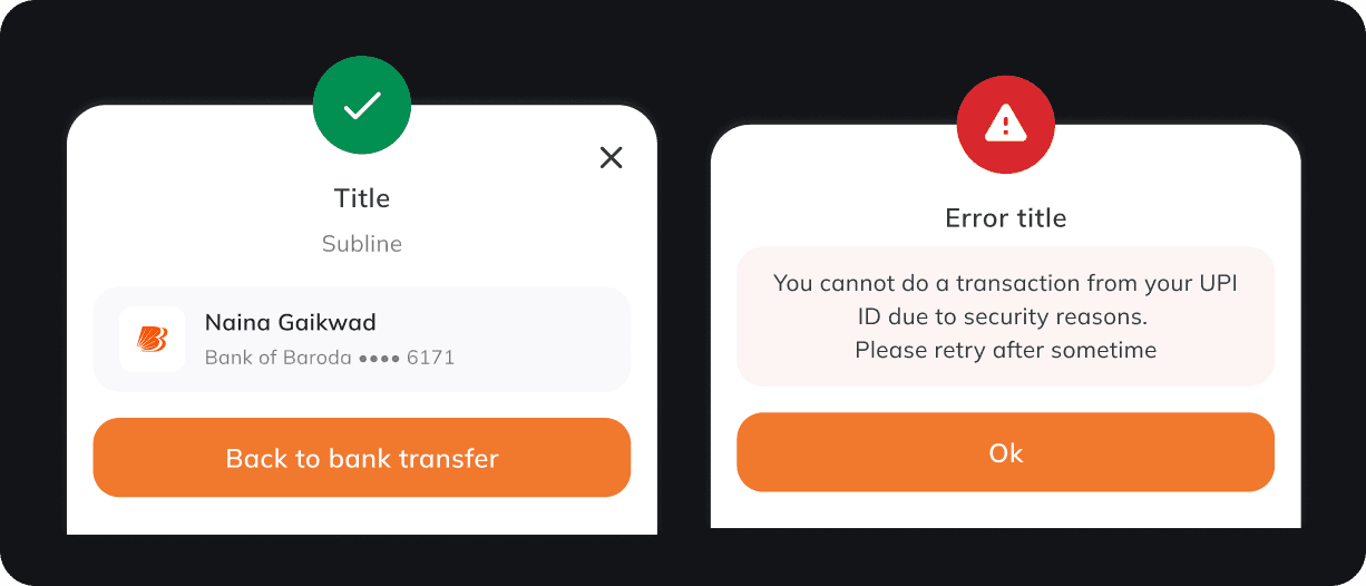
Design system in action
We created nearly 200 UI components that could be reused across the app. Creating components reduced the effort and the time taken by engineering and design teams.

Consistency is the key
For iMobile 3.0, we built each component using platform-specific libraries while adhering to a shared set of design tokens and guidelines. This approach created a multi-platform design system that ensured consistent UI across all platforms. By standardizing the visual and interaction patterns at the system level, we significantly reduced cross-platform discrepancies and lowered QA cycles by 40%.
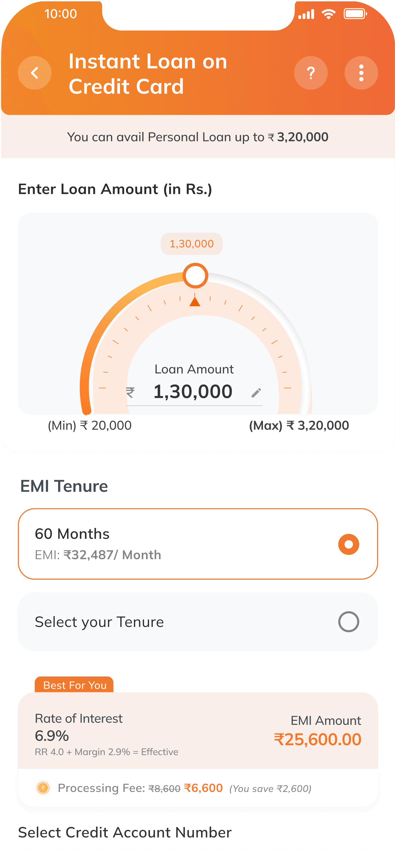
You can avail Personal Loan up to ₹ 3,20,000
Best For You
Processing Fee: ₹8,600 ₹6,600
(You save ₹2,600)
RR 4.0 + Margin 2.9% = Effective
EMI Amount
Rate of Interest
₹25,600.00
6.9%
Assisted by an ICICI Bank Representative?
EMI Tenure
60 Months
EMI: ₹32,487/ Month
Select your Tenure
Enter Loan Amount (in Rs.)
Loan Amount
(Min) ₹ 20,000
(Max) ₹ 3,20,000
1,30,000
1,30,000
Instant Loan on
Credit Card
Select Credit Account Number
•••• 6789
Confirm Loan Details

Learnings & Reflections
Building for 250+ features at scale meant carefully balancing consistency vs. flexibility—a design system could not be overly rigid.
I observed how communication gaps between teams could snowball into major implementation flaws down the line. Even with a robust design system, clear cross-team communication was crucial.
To simplify this, standardisation of flows and components helped reduce ambiguity and kept everyone aligned.
Impact
Delivered a scalable design system that reduced design and development time from 2–3 weeks per flow to under a week.
Future-proofed the platform with standardised journeys and reusable components, enabling faster feature rollouts.
Improved user experience by modernising navigation, enhancing discoverability, and embedding personalisation into flows.
Strengthened collaboration between teams, leading to more efficient handoffs and fewer implementation issues.
Recognition & Accolades
Recognised internally as a flagship digital revamp, setting a benchmark for ICICI’s digital ecosystem.
Praised by stakeholders for reducing friction in delivery and aligning with global digital banking standards.