Shipped
ICICI Smart Statement
An interactive, digital credit card statement designed to offer users a 360° view of their card usage, rewards & offers—all in one place.
I led the design of Smart Statements — a new way for ICICI Bank users to track, search, and manage their credit card spends. Worked closely with analytics, product, and tech teams to define features, plan implementation, and deliver the final design.
Smart Statements is a simplified spend insights platform that helps users make sense of their monthly statements, avoid penalties, and discover relevant offers — all in one place.
Product
Credit Card Smart Statement
Skills
Product Design
Heuristic UX Audit
UX Research & User Interviews
MVP Definition
Feature Prioritization
Wireframing, UI Design & Prototyping
My Role
Design Lead
Timeline
Q2 2023
Let’s talk about ICICI’s Credit Card Ecosystem
India’s top credit card issuer powering diverse spends and rewards.
ICICI Bank is one of India’s largest and most widely used credit card issuers, offering products that range from basic cards to premium co-branded partnerships with Amazon, Emirates, and MakeMyTrip. Its credit card ecosystem plays a major role in shaping users’ monthly financial behavior, especially in urban and digitally active segments.
Some Numbers for context
17M+
active CC users
₹2.5L Cr+
annual spend
₹35K Cr
Monthly spend
So, Where Does Smart Statement Fit In?
Simplifying fragmented credit data
As credit card usage grew, so did the complexity of managing it. Users weren’t just looking at one number—they were juggling due dates, reward points, EMIs, cashback, subscriptions, and spending limits across cards. Many had to dig through multiple tabs, PDFs, and transaction lists just to understand where their money was going.Smart Statement was designed to simplify this experience. Instead of a static PDF or a cluttered transaction list, it offers a contextual snapshot—one that helps users quickly understand their financial standing, spot key insights, and take action when needed. It’s not just a statement; it’s a smarter layer on top of their credit life.
Defining Scope
Breaking Down the brief
To ground the feature in real user needs, I began by unpacking existing credit card journeys—focusing on how users currently receive, read, and interpret their statements. This included mapping pain points across billing cycles, rewards tracking, and EMI breakdowns. To ensure the solution aligned with both user expectations and business goals, I conducted a competitive analysis of smart statement experiences across neo-banking and global fintech apps.
By identifying patterns in how modern platforms simplify financial information, and where ICICI’s existing flow fell short, we were able to define the opportunity space for a smarter, more contextual statement experience.
Project Goal
To design a Smart Statement experience that simplifies complex credit card data into a clear, contextual, and actionable snapshot, helping users track spends, EMIs, rewards, and dues effortlessly, while aligning with ICICI’s broader digital strategy.
Conducting Workshops
Understanding User Behaviour
Understanding user behavior surrounding credit cards was paramount. This would help us prioritize features and reveal valuable insights when designing for key user needs, such as timely payment reminders, spending trend analyses across months, and detailed categorization of expenditures by category or merchant. For this, I scheduled a workshop with the ICICI’s credit card team, where we did a red route mapping to understand how and what features were the most important for the users
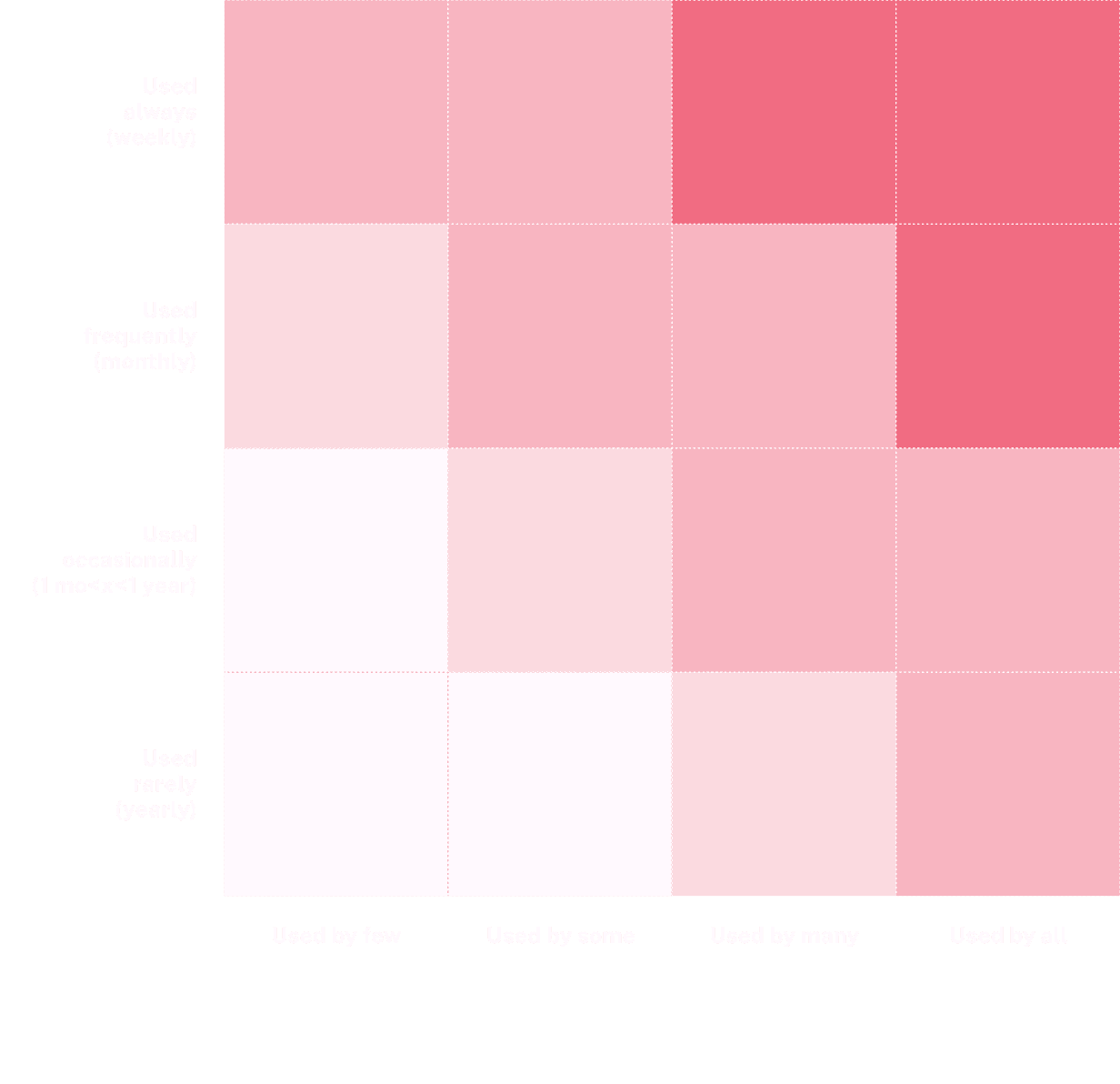
Key Findings from this exercise
Understanding User Behaviour
4–5 core actions dominate usage
Tasks like checking due amount, available credit, using filters to view transactions, and paying card balance are used frequently by nearly all users—these must be top-layer, high-visibility features.
Users value insight + action in one flow
Features like Spend Insights, EMI tracking, and CIBIL Score are not daily-use, but when used, users expect to take action (e.g., convert to EMI, increase limit). These need to be easily discoverable and actionable.
Rewards matter—but clarity is key
Users access reward features less frequently, but low NPS is linked to lack of clarity. So while it’s not a top priority in frequency, it’s critical for experience quality, and needs to be simplified and surfaced contextually.
Administrative features are rarely used
Tasks like blocking cards, updating address, or tagging spends are used by few and infrequently. These should be moved to secondary menus or collapsible help sections to avoid visual clutter.
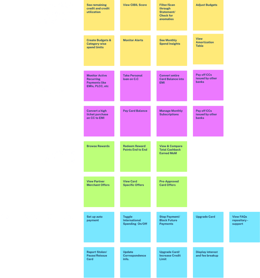
Making sense of the Data
This helped us prioritize the features
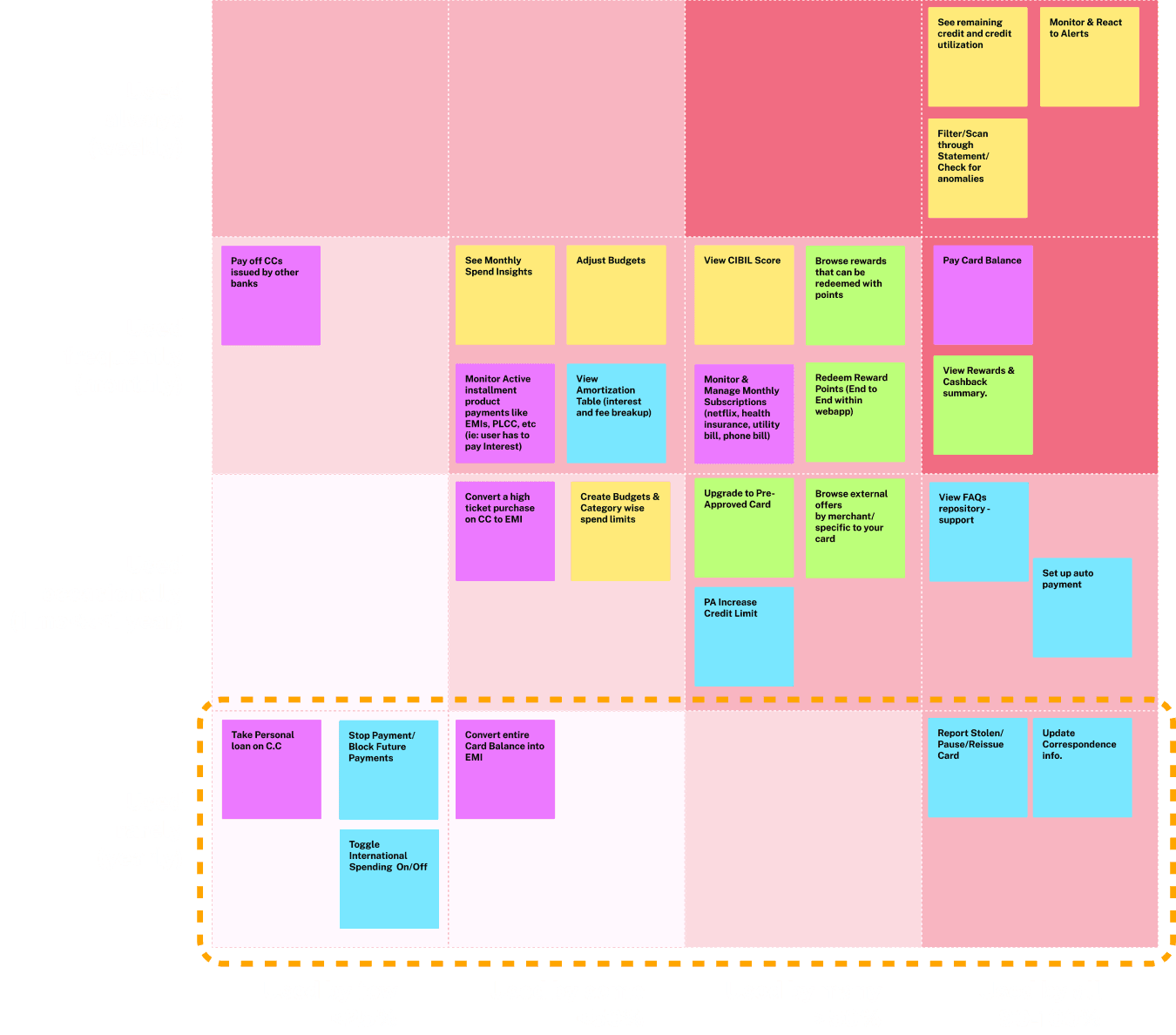
Based on the results of our research and benchmarking, I divided the cyclic nature of User Journey into 3 parts based on priority
Mandatory Visit — High Priority
Occurs around MAD (Minimum Amount Due) Date
User intent
Review, pay, and avoid penalties
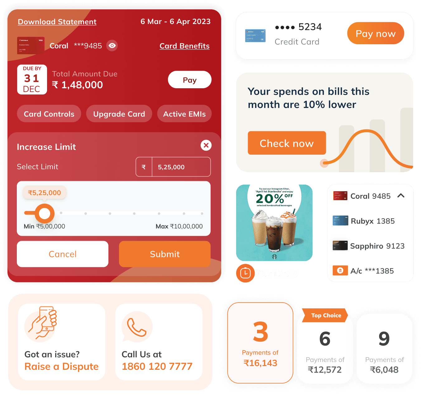
Dashboard showing due amount, due date, and urgency indicator
View & filter transactions to verify spends
Pay bill / EMI / PLCC with nudge to enable AutoPay
Access Spends & Rewards Insights
View updated Amortization Table (for active loans)
Nudge to convert balance to monthly EMI plan
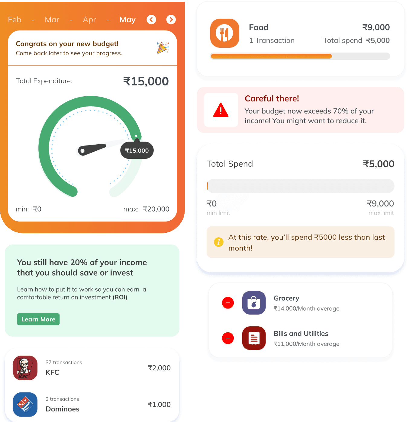
User May Linger — Medium Priority
Occurs right after bill payment
User intent
Optimise, explore, or set up control
Manage / Set Budgets
View & manage recurring subscriptions
Access Pre-approved Card & Limit Upgrades
Alerts for expiring rewards
Suggest relevant products for instant redemption / EMI offset
Explore ICICI reward catalogue + add to Wishlist
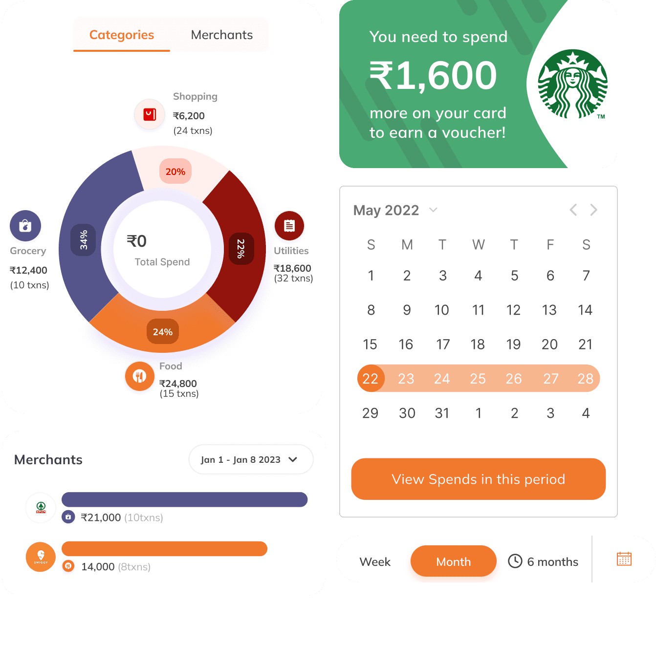
Habitual Visit — Low Priority
Occurs during mid-billing cycle
User intent
Explore or track progress casually
Continue managing Budgets
See weekly spend insights
View recent transactions and spend breakdown
Track wishlist milestone progress
Nudge toward investment or cross-sell products
Summarizing our insights
Putting things in perspective
Most crucial function was to review, pat and avoid penalties
Users often return just in time — around the Minimum Amount Due (MAD) date — with a clear purpose: to review what they owe, double-check recent spends, and make the payment. This is one of the most critical moments in their journey, driven by urgency to avoid penalties or interest. It’s also the right time to offer helpful nudges — like enabling AutoPay or converting dues into EMIs — that make future payments smoother and stress-free.
After Paying, Users Pause to Optimise
Once the bill is paid, the urgency fades — but users often linger. This is when they shift from action to exploration: setting budgets, reviewing subscriptions, or checking for card upgrades. It’s also a moment to surface time-sensitive nudges like expiring rewards, suggest relevant redemptions, or prompt wishlist activity in the ICICI rewards catalogue. The mindset here is more reflective — a good time to introduce features that build control and unlock value.
Casual Check-ins Between Billing Cycles
These are low-pressure visits — users drop in mid-cycle to casually track progress or explore features. They might glance at weekly spend trends, manage budgets, or browse recent transactions. It’s also a window to highlight wishlist milestones or suggest converting spends to EMIs. While urgency is low, it’s a good moment for light nudges around investments or relevant product suggestions without overwhelming the user.
Adapting Design for Web App Realities
Adapting to browser constraints without compromising usability.
Web apps come with unique constraints—limited APIs, gesture conflicts, and fragile sessions. Our design had to be lean, resilient, and native-like where it mattered.
Rethinking Gesture Patterns
Unlike native apps, web apps inherit browser gestures—e.g., left/right swipes often trigger browser “Back” and “Forward.”
We avoided horizontal swipe gestures for navigation and instead used tap, progressive disclosure, and vertical stacking for multi-level flows.
Accounting for Browser UI Interference
Browsers on mobile have sticky footers (URL bar, nav bar) that eat into vertical space, especially on smaller devices.
We ensured that CTAs, scrollable containers, and content sections were not blocked, using dynamic spacing and bottom-safe margins.
Performance & Load Constraints
Web apps are typically heavier and slower to load than native apps, especially on low-bandwidth.
We optimized images, avoided heavy animations, and used progressive loading for transactional data and charts.
No Native Components or APIs
Native components like modals, pickers, camera access, native payment flows, or push notifications weren’t accessible.
Designed custom dropdowns, calendars, and file upload states, mimicking native-like behavior while remaining browser-safe.
Session Persistence & Navigation Limits
Browser tabs can be closed anytime, and web apps don’t persist state like native apps.
We designed flows to be modular and resumable, so users don’t lose progress mid-way.
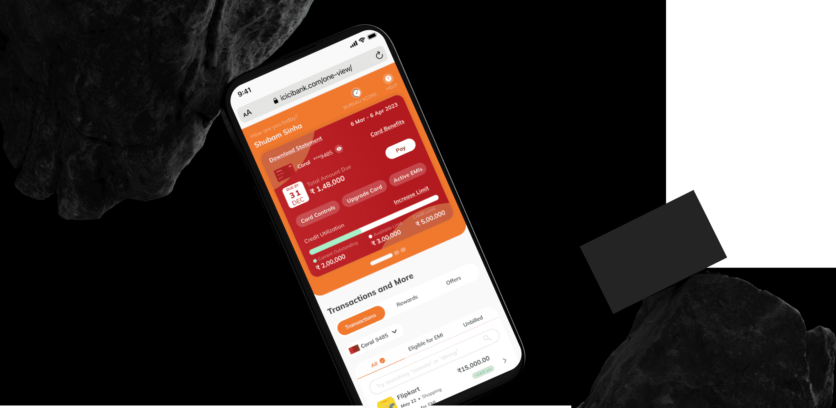
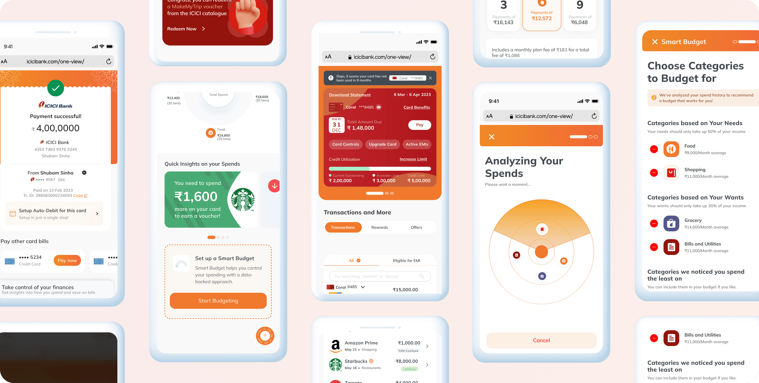
Final Designs
Adapting to browser constraints without compromising usability.
Web apps come with unique constraints—limited APIs, gesture conflicts, and fragile sessions. Our design had to be lean, resilient, and native-like where it mattered.
Critical Visits Around Due Date
Essential Bill Actions
The goal was to surface critical actions upfront — review, pay, avoid penalties — while smartly cross-selling features like AutoPay and EMI. The challenge: remove clutter, but keep what matters to both user and business.
Pay Bill
Convert to EMI
After Payment, Users Linger
From urgency to exploration
This is where user behavior shifts — from skimmers to explorers. With the urgency of payment behind them, users slow down to optimise: setting budgets, managing subscriptions, checking for upgrades, or exploring reward redemptions. It’s a moment to add value through subtle guidance — without adding friction.
Rewards & Offers
Setting up a Budget
Mid-Cycle Check-ins
Low-pressure, high-opportunity moments
This is when users come with no urgency — just casually checking spends, reviewing budgets, or tracking progress. The focus here was to keep things light and intuitive for users, while gently surfacing features like card upgrades or loans against credit, turning quiet visits into smart business opportunities.
See Monthly Spends
Cross-sell
Learnings & Reflections
Working on Smart Statement gave me deeper insights into the cyclic nature of user behavior around credit card usage. We observed three recurring patterns — Official Visits around Due Dates, Post-Payment Linger, and Mid-Cycle Check-ins. Designing with these cycles in mind highlighted the importance of creating predictable, supportive touchpoints that matched user intent at different stages of the billing journey.
This experience reinforced how financial design isn’t just about presenting data, but about anticipating rhythms of engagement—when users are anxious, when they seek reassurance, and when they’re casually exploring. Recognizing and designing for these cycles not only improved clarity but also deepened trust, by making the app feel synchronized with user habits rather than reactive to them.
Impact
Post-launch, the Smart Statement feature transformed how users interacted with their credit card data. Customers reported greater transparency and trust, with a noticeable reduction in call-center queries around billing cycles and payment dues. Internally, this also reduced support costs and strengthened ICICI’s positioning as a customer-first digital bank.
Recognition & Accolades
The Smart Statement was one of the pilot flows where iMobile Pay 3.0 was first implemented, serving as a testbed for the new design language and interaction principles. Its success validated the direction of the revamp, with leadership showcasing it internally as proof of how clearer UX could directly influence trust, adoption, and financial literacy. Positive feedback from early adopters reinforced its impact, making Smart Statement a key stepping stone in shaping the broader 3.0 experience.